Color pickers are essential tools for designers, developers, and anyone working with digital colors. These powerful utilities allow you to extract colors from images, websites, and digital content, enabling you to create cohesive color schemes and maintain consistency across your projects. Whether you're building a website, designing marketing materials, or developing a brand identity, mastering color picker tools will significantly enhance your design workflow and creative output.
In this comprehensive guide, we'll explore different types of color pickers, learn how to use them effectively, and discover professional techniques for creating beautiful designs with extracted colors.
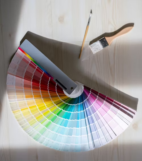
Understanding Color Picker Tools
Color pickers come in various forms, each designed for specific workflows and use cases. Understanding the different types helps you choose the right tool for your needs and maximize your design efficiency.
What Color Pickers Do
Color pickers analyze pixels and extract precise color values in various formats (HEX, RGB, HSL), enabling accurate color matching and palette creation for professional design work.
Types of Color Picker Tools
- Browser-Based Tools: Online color pickers accessible from any device
- Desktop Applications: Standalone software with advanced features
- Browser Extensions: Integrated tools for web design workflows
- Mobile Apps: Portable color picking for on-the-go inspiration
- Design Software Built-ins: Integrated tools in Photoshop, Figma, etc.
Key Features to Look For
- Multiple Format Support: HEX, RGB, HSL, CMYK output options
- Magnification: Pixel-level precision for accurate sampling
- Color History: Save and organize previously picked colors
- Palette Generation: Create harmonious color schemes
- Export Options: Save palettes in various formats
Color Picker Tool Categories
Different color picker tools serve different purposes in the design workflow. Understanding when to use each type helps you work more efficiently and achieve better results.
Web-Based Pickers
UniversalExamples: ImageColor Tools, Adobe Color, Coolors
Best for: Quick color extraction, team collaboration
Pros: No installation, cross-platform, always updated
Cons: Requires internet, limited offline features
Desktop Applications
ProfessionalExamples: ColorSync Utility, Just Color Picker
Best for: Professional workflows, system-wide picking
Pros: Advanced features, offline use, system integration
Cons: Platform-specific, requires installation
Browser Extensions
IntegratedExamples: ColorZilla, Eye Dropper, ColorPick Eyedropper
Best for: Web design, quick website color sampling
Pros: Seamless browser integration, instant access
Cons: Browser-dependent, web content only
Mobile Apps
PortableExamples: Adobe Capture, Pantone Connect
Best for: Real-world color capture, inspiration gathering
Pros: Camera integration, portability, cloud sync
Cons: Small screen, limited precision
Step-by-Step Color Picking Guide
Follow this systematic approach to extract colors effectively and create professional color palettes that enhance your design projects.
Professional Color Picking Workflow
Choose Your Tool
Select the appropriate color picker based on your source material and workflow requirements.
Prepare Your Source
Ensure good lighting and image quality. Clean your screen for accurate color representation.
Sample Strategic Colors
Pick dominant, accent, and supporting colors. Focus on colors that represent the mood and style.
Organize Your Palette
Group related colors and create a logical hierarchy. Document color codes in multiple formats.
Test and Refine
Apply colors in your design context. Adjust saturation, brightness, or hue as needed.
Save and Share
Export your palette in appropriate formats. Share with team members or save for future projects.
/* Extracted Color Palette */
:root {
  /* Primary Colors */
  --primary-blue: #2563eb;
  --primary-blue-rgb: rgb(37, 99, 235);
  --primary-blue-hsl: hsl(217, 91%, 60%);

  /* Secondary Colors */
  --accent-orange: #f59e0b;
  --accent-green: #10b981;

  /* Neutral Colors */
  --gray-dark: #374151;
  --gray-light: #f3f4f6;
  --white: #ffffff;
}
Advanced Color Picking Techniques
Master these professional techniques to create more sophisticated and effective color schemes that elevate your design work.
Strategic Color Sampling
Don't just pick the most obvious colors. Look for subtle tones, shadows, and highlights that add depth to your palette.
Context-Aware Selection
Consider how colors will be used in your design. Pick colors that work well for text, backgrounds, and accent elements.
Color Variation Creation
Use picked colors as base values to create lighter and darker variations for comprehensive design systems.
Collaborative Workflows
Share color palettes with team members and maintain consistency across different design tools and platforms.
Professional Tips for Better Results
- Use Multiple Sources: Pick colors from various images for richer palettes
- Consider Lighting: Account for how colors appear under different lighting conditions
- Test Accessibility: Ensure picked colors meet contrast requirements
- Document Context: Note where and how each color should be used
- Create Variations: Generate tints, shades, and tones from base colors
Pro Tip: The 60-30-10 Rule
When picking colors, plan for the 60-30-10 distribution: 60% dominant color, 30% secondary color, and 10% accent color for balanced, professional designs.
Common Color Picking Mistakes
Avoid these frequent pitfalls to ensure your color picking efforts result in professional, effective color schemes.
Screen Calibration Matters
Uncalibrated monitors can lead to inaccurate color picking. Ensure your display is properly calibrated for color-critical work.
Mistakes to Avoid
- Picking too many colors: Limit palettes to 3-7 colors for cohesion
- Ignoring context: Colors that look good in isolation may not work in your design
- Forgetting accessibility: Always check contrast ratios for text readability
- Not testing variations: Ensure colors work in different sizes and contexts
- Overlooking brand guidelines: Maintain consistency with existing brand colors
Quality Control Checklist
Conclusion
Color pickers are powerful tools that can transform your design process and help you create more cohesive, professional color schemes. By understanding the different types of tools available, following systematic workflows, and applying advanced techniques, you can consistently extract and apply colors that enhance your design projects and create meaningful visual experiences.
Remember that color picking is both a technical skill and an artistic practice. The more you use these tools and experiment with different approaches, the better you'll become at identifying and utilizing colors that serve your design goals and connect with your audience.
Ready to Start Picking Colors?
Try our professional color picker tools to extract colors and create stunning palettes.